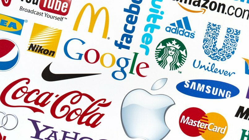
Your logo is the first thing that the world get to see about your business. It really sets the tone for WHO YOU ARE and WHAT YOU DO? Is your logo still working for you and getting your business the brand recognition and awareness that you need? Is your logo up-to-date with the modern advertising environment or is it stuck back in the 80’s.
The following 5 brand rules will help guide you if you are creating a logo from scratch or you need to update your current one.
- The Right Fit
Some questions you need to ask yourself are, is your logo appropriate for you and your industry? You should take some time to do research and study your competition. Check out common trends for logo design to give you an idea of what works well. You don’t want to copy the rest, but by seeing what everyone else is doing, will allow you to see what is recognised in your industry, and in fact then be different and stand out from the crowd.
- Simplicity
Logos so be quick and easy to recognised, therefore the key is making the simple and easy for everything to understand. Remember, the goal is to build brand awareness and recognition. The essence of “Your logo” is to sums up “Who you are” in a single image. Complex images are less likely to be recalled later, so keep the logo bare-bones. Keep in mind, too, that a simple logo reproduces much more neatly to different sizes. You want your logo to look the same in all forms of advertising or promotion products.
- Colour Connections
Colours can be symbolic and carry meaning for various cultures. Therefore you must make sure that your colour scheme fits in well with all aspects of your business and doesn’t not offend anyone. A little research can help you decide which colours may best suit your brand. Example in Asian culture, red is seen as a lucky colour.
You should always make sure that your logo can be reproduced will in black and white, and also on a few different colour backgrounds. This will help you standardise your marketing over different forms or media and advertising formats.
- Avoiding Special Effects
Resist the temptation to add drop shadows, gradients, and other embellishments. Of course there are always exceptions to this and every other rule, but in keeping with the idea that the logo should be simple, avoid these extra effects?
- Functional Big and Small
How does your logo look when it’s blown up to Billboard size? What happens when it’s printed on the corner of your letterhead and you’re looking at it from across the room? Can you still tell it’s your logo? That’s an important test for determining whether your logo will function in all the potential places it may be used. As noted earlier, just because it looks good on screen doesn’t mean it will translate into a recognizable logo when it’s very large, or small, when printed.
Brand Guidelines
You need to make sure your logo is consistent, and the only way you can do this is by setting Brand Guidelines. Guidelines will enable any designer or agency to determine the pantone colour, text size, space around logo and borders so that your logo replicates the same, no matter what form of advertising is being used.
So when considering changing or updating your logo, you need to address the above 5 brand rules. The point of revamping your logo is to increase recognition or bring your brand into the 21st Century; if those considerations don’t apply to your logo, then don’t change it.


Sorry, the comment form is closed at this time.